TOC
Statcast Pitching Data
This post explores some of the statcast pitching dimensions and highlights some interesting ways to visualize the data.
Pitch Type
To get started, we will import a data set we collected in a previous post, which contains Aroldis Chapman’s pitch data from 2015-2021.
df_chapman = readr::read_csv("./chapman_20150301-20211001.csv")Let’s start by identifying Chapman’s favortie ptich.
from bokeh.io import output_file, show, save
from bokeh.plotting import figure
from bokeh.models import ColumnDataSource
import pandas as pd

df_chapman = pd.read_csv("./chapman_20150301-20211001.csv")
df_pitch_lookup = pd.read_csv("./pitch_dict.csv").set_index("pitch_type")

df_pitch_count = (df_chapman
                    .groupby('pitch_type')
                    [['pitch_type']]
                    .size()
                    .sort_values(ascending = True)
                    .to_frame("count")
                    .reset_index()
                    .join(df_pitch_lookup, on = "pitch_type")
                    .assign(percent = lambda df: 100*df['count']/df['count'].sum()))

print(df_pitch_count)
source = ColumnDataSource(df_pitch_count)
TOOLTIPS = [("Percent","@percent{0.2f} %")]
p = figure(y_range = df_pitch_count.pitch_name,
tooltips = TOOLTIPS,
title = "Aroldis Chapman Pitch Types: 2015-2021")
p.hbar(y="pitch_name", right = "count", source = source, height = .7)p.x_range.start = 0
p.outline_line_color = None
p.grid.grid_line_color = None
p.xaxis.minor_tick_line_color = None
p.yaxis.major_tick_line_color = None
p.yaxis.axis_line_color = None
output_file("pitch_count.html")
save(p)Next, we can analyze if his pitch preference has changed over time.
from bokeh.palettes import all_palettes

pal = all_palettes['Category10']
# print(pal)

df_chapman[['game_date']].dtypes
df_pt_gd = ( df_chapman[['game_date','pitch_type', 'pitch_name']]
        .groupby(['game_date','pitch_type', 'pitch_name'])
        .size()
        .to_frame('count')
        .reset_index()
        .assign(game_date = lambda df: pd.to_datetime(df['game_date']))
        .assign(year = lambda df: df.game_date.dt.year)
        .groupby(['year','pitch_type', 'pitch_name'])
        .agg({'count':'sum'})
        .reset_index()
        .assign(total = lambda df: df.groupby('year')['count'].transform('sum'))
        .assign(percent = lambda df: (df['count']/df['total'])*100)
)

# df_pt_gd.info


pitch_types = df_pt_gd['pitch_type'].drop_duplicates().to_list()
# print(pitch_types)
num_pitch_types = len(pitch_types)
pal = pal[num_pitch_types]
# print(pal[0])

pal = {'CH':'green',
       'FF':'red',
       'FT':'orange',
       'SL':'yellow',
       'FS':'blue',
       'SI':'orange'}

print(pal)
['CH', 'FF', 'FT', 'IN', 'SL', 'SI', 'FS']TOOLTIPS = [
("Pitch Type","@pitch_name"),
("Year", "@year"),
("Percent","@percent{0.2f} %")]
p = figure(width=1000,
tooltips = TOOLTIPS,
title = "Aroldis Chapman Pitch % by Season"
# x_axis_type = "datetime"
)
print(pal['CH'])for count, value in enumerate(pitch_types):
print(count)
print(value)
print(pal.get(value))
pitch_name = df_pt_gd[df_pt_gd['pitch_type'] == value]['pitch_name'].drop_duplicates().to_list()[0]
print(pitch_name)
source = ColumnDataSource(df_pt_gd[df_pt_gd['pitch_type'] == value])
p.line('year','percent', color = pal.get(value), source= source, width = 2,
legend_label = pitch_name)
p.circle('year','percent', color = pal.get(value), source= source)
p.xgrid.grid_line_color = None
p.xaxis.axis_line_color = None
p.xaxis.minor_tick_line_color = None
p.xaxis.major_tick_line_color = 'grey'

p.yaxis.axis_line_color = None
p.yaxis.minor_tick_line_color = None
p.yaxis.major_tick_line_color = None
p.y_range.start = 0

p.yaxis.ticker = [25, 50, 75]
p.outline_line_color = None
p.add_layout(p.legend[0], 'right')
p.legend.border_line_color = None


output_file("pitch_count_by_date.html")

save(p)Pitch Location
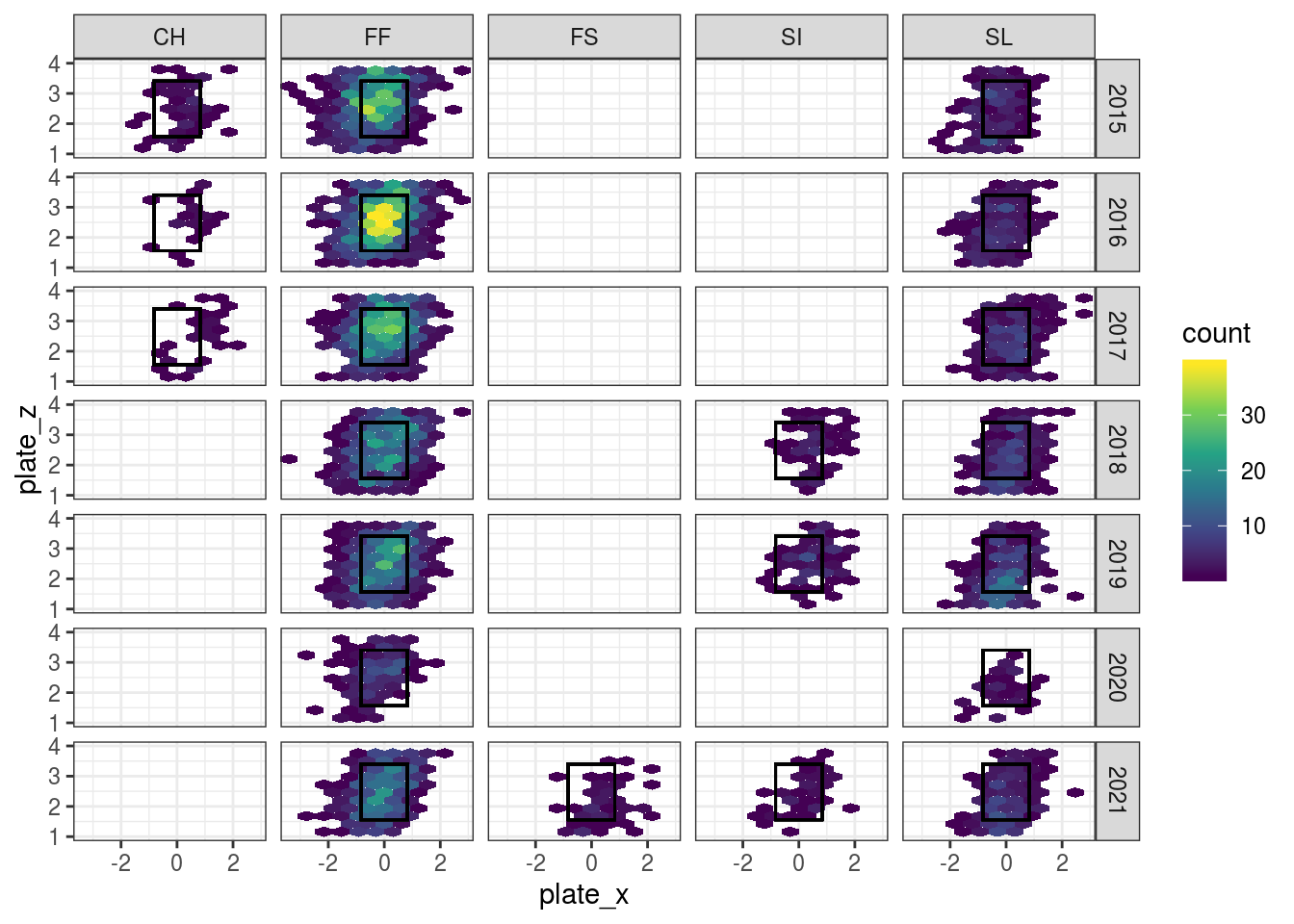
Let’s now look at his location by pitch type over time and see if anything has changed.
avg_zone <- df_chapman %>%
  summarise(sz_top = mean(sz_top, na.rm = TRUE),
            sz_bot = mean(sz_bot, na.rm = TRUE))


df_chapman %>%
  # count(plate_x, plate_z) %>%
  # filter(!is.na(plate_x)) %>%
  group_by(pitch_type, game_year) %>%
  mutate(count = n()) %>%
  ungroup() %>%
  filter(count > 15) %>%
  filter(pitch_type %in% c('CH','FF', 'FS', 'SI', 'SL')) %>%
  # arrange(desc(n)) %>%
  ggplot(aes(x = plate_x, y = plate_z)) +
  geom_hex(bins = 10) +
  # stat_density_2d(aes(fill = ..level..), geom = "polygon") +
  # geom_density_2d() +
  geom_rect(aes(xmin = -.83 , xmax = .83, ymin = avg_zone$sz_bot, ymax =      avg_zone$sz_top),color = 'black', alpha = 0) +
  # stat_bin_hex(bins = 10) +
  scale_fill_continuous(type = "viridis") +
  ylim(c(1,4)) +
  facet_grid(game_year ~ pitch_type) +
  theme_bw()
Results
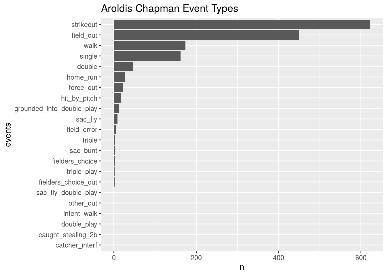
We will now build a few charts to analyze the results of his pitches.
df_chapman %>%
  filter(!is.na(events)) %>%
  count(events) %>%
  arrange(desc(n)) %>%
  mutate(events = fct_reorder(events, n, .desc = FALSE)) %>%
  ggplot(aes(x = events,  y = n)) +
  geom_col() +
  coord_flip() +
  labs(title = "Aroldis Chapman Event Types")
From the chart above, we can see Chapman is a strikeout pitcher.
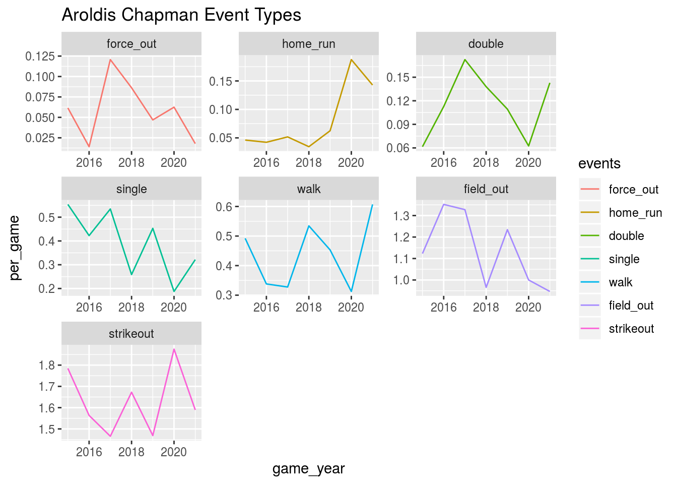
Let’s see if Chapman’s events have changed over time.
df_games <- df_chapman %>%
  distinct(game_date) %>%
  mutate(year = lubridate::year(game_date)) %>%
  count(year) %>%
  mutate(games = n) %>%
  select(year, games)


df_chapman %>%
  left_join(df_games, by = c("game_year" = "year")) %>%
  filter(!is.na(events)) %>%
  count(events, game_year, games) %>%
  group_by(events) %>%
  mutate(total_events = sum(n)) %>%
  filter(total_events > 20) %>%
  ungroup() %>%
  arrange(desc(n)) %>%
  mutate(events = fct_reorder(events, n, .desc = FALSE)) %>%
  mutate(per_game = n/games) %>%
  ggplot(aes(x = game_year,  y = per_game, color = events)) +
  geom_line() +
  labs(title = "Aroldis Chapman Event Types") +
  facet_wrap(~events, scales = "free")
From this chart, we can see Chapman is trending up in home runs, walks, doubles, and down in force_outs, strikeouts, and force outs, which is not what you want from your closer.